GPMelt’s main results

1 Introduction

In the following, we go through the files created by GPMelt after running the example of the tutorial, i.e. the ATP 2019 dataset with a subset of 16 IDs.

As a comparison, we use the published results that can be found on Zenodo DOI, saved under the name ATP2019/prerun/GPMelt_p_values.rds.

Note: The published results have been obtained with a previous version of the implementation that did not use Nextflow. The implementation has been fully rewritten to be user-friendly and provides a lot of the results for free, when we previously had to do some work.

For example:

  • ATP2019/prerun/GPMelt_p_values.rds is obtained from ATP2019/GPMelt_results/Ratios_NullDataset.rds and ATP2019/GPMelt_results/Ratios_RealDataset.rds, as explained in the code on gitlab in Analysis/ATP2019/ATP2019_Analysis.qmd.

  • Similarly, we will see that Nextflow provides us with a report about resource requirements which was previously done manually, as exemplified on gitlab in Analysis/ComputationalCost/ComputationalCost.qmd.

2 Checking the convergenve

A good practice is to first check the convergence of the fits. For this, we use the loss associated to the fit of the full model \(\mathcal{M}_1\).

As explained here, the parameters of the model are estimated by minimising the negative log marginal likelihood of the observation.

The negative log marginal likelihood of the observation is a loss function which measures the goodness-of-fit of a model.

The algorithm is trying to minimise this loss. The convergence is assumed to be reached when the loss remains constant for a large number of iterations.

As a quick check, you can start by looking at your favorite proteins in the list of plots. Go in the folder Results_ATP2019/Plots and select your proteins. The first plot (which should be page two) represents the evolution of the loss with the number of iterations.

To proceed to a more general check, we can load the file full_hgpm_fit_loss_values_df.csv.

Code
library(dplyr)
library(ggplot2)
library(tidyr)
library(readr)
library(forcats)
library(latex2exp)
library(colorBlindness)
library(ggpubr) # ggarrange
library(ggrepel) # geom_label_repel
library(viridis) # scale_fill_viridis
source("../../utils.R")
loss_values <- read.csv("NextFlow/Results_ATP2019/full_hgpm_fit_loss_values_df.csv")

2.1 Plotting the convergence for a subset of IDs

We start by adding the variable iteration, before plotting the loss values. We have 16 IDs and 500 iterations for each fit.

loss_values$iteration <- rep(1:500, times = 16)
ggplot(loss_values)+
    geom_point(aes(x=iteration, y=LossValue), size=0.5)+
    facet_wrap(.~fitted_levels_1, scale= "free")+
    ggtitle("Convergence analysis")+
    theme_Publication(base_size = 10)

Because we have only 16 IDs, we can look at one glance the convergence status of all IDs. Here we can see that AARS2 did not converge as quickly as the other IDs, as there was likely another local optimum on which the algorithm got stuck for a bit.

2.2 Assessing the stability of the convergence

If we have more IDs, we can’t really plot and check the convergence for thousands of them.

Below is a suggestion for what can be done instead. Feel free to use additional or other summary statistics to check the overall convergence.

  1. We first check if the loss value takes the value NA, which means that there is some sort of problem.
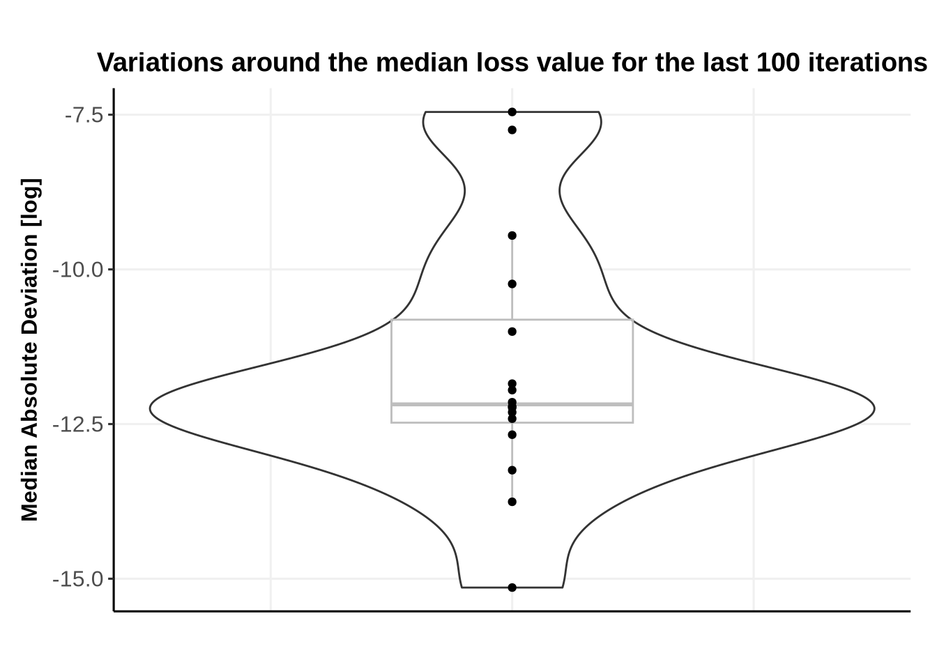
  2. We then compute the median loss over the last 100 iterations, along with the Median Absolute Deviation (MAD). Large deviations around the median value usually indicate lack of convergence.

Below we see that there is no NA values in the loss.

loss_values %>% filter(is.na(LossValue)) %>% arrange(fitted_levels_1)
[1] LossValue       fitted_levels_1 iteration      
<0 rows> (or 0-length row.names)

We continue with the median loss and MAD.

N_last_iterations = 100

FinalIterations <- loss_values %>% 
  group_by(fitted_levels_1) %>%
  slice_tail(n = N_last_iterations) %>%
  summarise(MedianLoss = median(LossValue, na.rm = TRUE), 
            MADLoss =mad(LossValue, na.rm = TRUE))

head(FinalIterations)
# A tibble: 6 × 3
  fitted_levels_1 MedianLoss     MADLoss
  <chr>                <dbl>       <dbl>
1 AAGAB               -1.34  0.00000530 
2 AAK1                -1.60  0.0000166  
3 AAMDC               -1.28  0.0000785  
4 AAMP                -1.49  0.00000645 
5 AAR2                -1.74  0.000432   
6 BANF1                0.837 0.000000265
Code
ggplot(FinalIterations, 
       aes(x=0,
           y=log(MADLoss)))+
  geom_violin(width = 0.3) +
  geom_boxplot(width = 0.1, color="grey", alpha=0.2)+
  geom_point()+
  #geom_jitter(width=0.1, alpha=0.9) + # geom_jitter can be used when more data points are present
  ggtitle(paste0("Variations around the median loss value for the last ", N_last_iterations, " iterations"))+
  xlab("")+
  ylab("Median Absolute Deviation [log]")+
  theme_Publication(base_size = 12)+
  theme(axis.text.x = element_blank(),
        axis.ticks.x =  element_blank(),
        legend.position = "bottom")

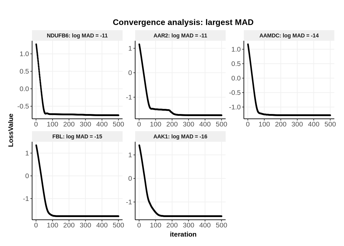
2.3 Checking more specifically the IDs with the worst convergence

Here all values are very small. However, it can still be informative (when dealing with much more IDs) to plot the convergence for the IDs with the largest MAD.

Code
N_largest_MAD <- 5 # choose more IDs if needed

Largest_MAD <- FinalIterations %>% 
  arrange(-MADLoss) %>% 
  slice_head(n = N_largest_MAD ) %>%
  dplyr::select(fitted_levels_1) %>% 
  pull()

df <- loss_values %>%
         filter( fitted_levels_1 %in% Largest_MAD) %>%
         left_join(FinalIterations) %>%
         mutate(fitted_levels_1 = fct_reorder(fitted_levels_1, -MADLoss))

custom_labeller <- function(value) {
  paste0(value, ": log MAD = ", round(log(df$MADLoss[match(value, df$fitted_levels_1)], 2)))
}

ggplot(df)+
    geom_point(aes(x=iteration, y=LossValue), size=0.5)+
    facet_wrap(.~fitted_levels_1, labeller = labeller(fitted_levels_1 = custom_labeller) ,scale= "free")+
    ggtitle("Convergence analysis: largest MAD")+
    theme_Publication(base_size = 10)

Alternatively, the user can select all IDs with MAD above a certain threshold, or a certain fraction of the largest MAD, etc…

For IDs which did not converge, the user can

  • rerun the fit on this subset with more iterations or an alternative model specification,
  • exclude these IDs from the analysis, if the lack of convergence is due to these IDs being too noisy for example.

3 The \(\Lambda\) statistics

After checking that our fits converged, and hence that the final results are meaningful, we can start looking at the results.

We start by looking at the GPMelt’s statistic \(\Lambda\).

As explained here, we define \(\Lambda\) to assess if two conditions present significantly divergent melting behaviour. This statistic is given by: \[ \Lambda = -2 \log \frac{p(Y \mid T, \theta^{MLE-II}, \mathcal{M}_0)}{p(Y \mid T, \theta^{MLE-II}, \mathcal{M}_1)} \ . \] This can be rewritten 1 in terms of loss as:

\[ \Lambda = -2 \cdot ( \text{loss}(\mathcal{M}_1) - \text{loss}(\mathcal{M}_0) )\] Here \(\text{loss}(\mathcal{M}_1)\) represents the loss value for model \(\mathcal{M}_1\) at the last iteration (similarly for \(\mathcal{M}_0\)). Because we directly use the loss valus in the computation of \(\Lambda\), \(\Lambda\) is not valid if the fit did not converge.

Hence \(\Lambda\) can be interpreted as comparing the goodness-of-fit of model \(\mathcal{M}_0\) and \(\mathcal{M}_1\).

The better the goodness-of-fit, the lower the loss value. Equivalently, this means that the larger \(\Lambda\), the more evidence we have against the null hypothesis that \(\mathcal{M}_0\) is enough to fit the data, compared to \(\mathcal{M}_1\).

3.1 Loading the results

The loss values for each model can be found in the p_values_*_wise.csv dataset ( with *standing for ID or dataset).

p_values_subset <- read.csv("NextFlow/Results_ATP2019/p_values_dataset_wise.csv")
p_values_fulldataset <- read_rds(file = "Analysis/ATP2019/prerun/GPMelt_p_values.rds")

p_values_subset contain the p-values obtained on the subset of 16 IDs, and p_values_fulldataset contains the p-values previously obtained (published) considering the full ATP 2019 dataset.

3.2 Arrange and combine the two datasets

In the former implementation, we saved the log marginal likelihood (denoted mll), while we now save the loss. The link is simple: \(\text{loss} = - \text{log marginal likelihood}\).

Code
p_values_fulldataset <- p_values_fulldataset  %>%
  dplyr::rename("treatment_condition" = "Level_2",
                "mll_full_model" = "Alternative",
                "mll_joint_model" = "Null",
                ) %>%
  mutate(loss_joint_model = - mll_joint_model, 
         loss_full_model = - mll_full_model) %>%
  dplyr::select(-X) %>%
  mutate(control_condition = "Vehicle")

compare_results <- full_join(
  p_values_subset %>%
    dplyr::select(-job_id, -comparison_id) ,
  p_values_fulldataset %>% 
    filter(Level_1 %in% c("AAGAB", "CDK13", "DPM1", "AAK1", "AAMDC", "AAMP", "AAR2", "NDUFB6" ,"MYO1G","BANF1", "DDX50", "FBL", "NOP56", "EIF3H", "IMPDH1", "NUCKS1")) %>% # filter to the 16 IDs of interest
    dplyr::select(-mll_full_model, -mll_joint_model),
  suffix = c("_subset", "_full"), 
  by = c("Level_1", "treatment_condition","control_condition")
) %>%
  pivot_longer(
    cols = ends_with(c("_subset", "_full")), 
    names_to = c("property", "origin_dataset"),
    names_pattern = "(.*)_(.*)"
  ) %>%
  pivot_wider(names_from = "origin_dataset",
              values_from = "value"
  )

3.3 Compare the results of the former and current implementation

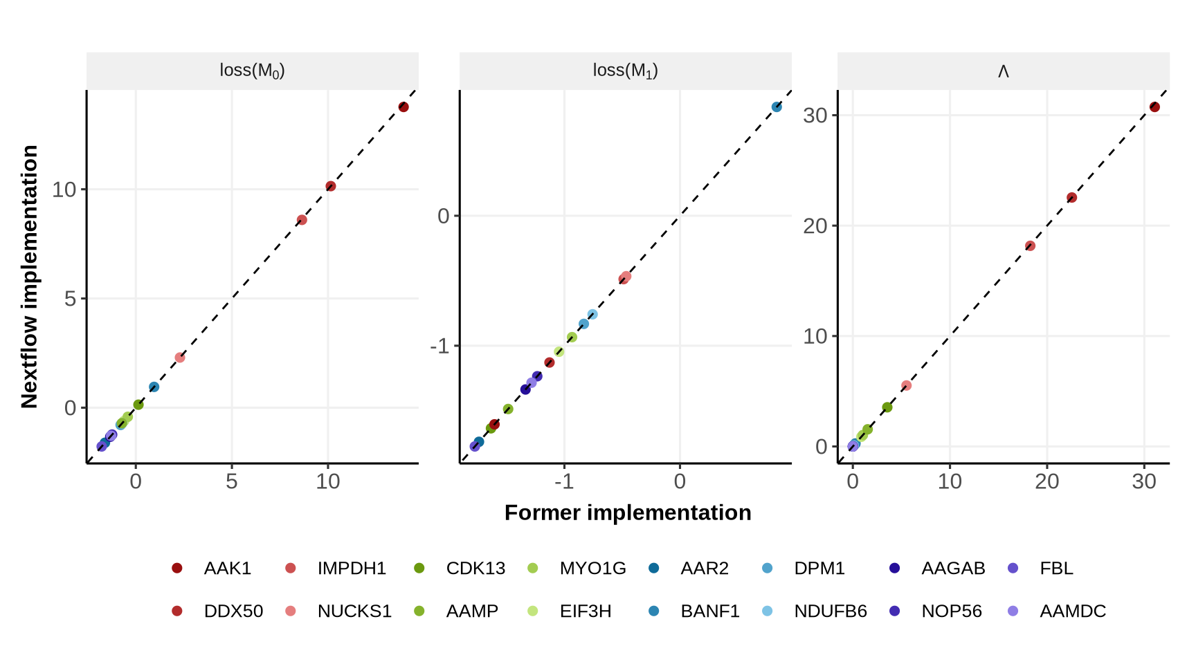
We now compare \(\text{loss}(\mathcal{M}_0)\) (loss_joint_model), \(\text{loss}(\mathcal{M}_1)\) (loss_full_model) and the statistic \(\Lambda\) (LikelihoodRatio) for the former implementation (the one used for the published results) and the new implementation using Nextflow.

Note: the variable name LikelihoodRatio might be confusing given that \(\Lambda\) is not a standard likelihood ratio test, however it is a ratio of (marginal) likelihoods.

We first select a colorblind palette from the colorBlindnesspackage:

Code
displayAllColors( SteppedSequential5Steps[c(c(1:4), c(11:14), c(16:19), c(21:24) )], color="white")

Below we see that the new implementation with Nextflow provides the same results than the former implementation (dotted line is the line y=x, IDs’ colors are ordered by \(\Lambda\) values, from red to purple).

Code
order_levels_1 <- compare_results %>%
  filter(property == "LikelihoodRatio") %>%
  arrange(-full) %>%
  dplyr::select(Level_1) %>% pull()

ggplot(compare_results %>%
         filter(property %in% c("loss_joint_model", "loss_full_model", "LikelihoodRatio" )) %>%
         mutate(Level_1 = factor(Level_1, levels = order_levels_1)))+
  geom_point(aes(x = full,   y = subset, color = Level_1), size=2)+
  geom_abline(slope = 1, linetype ="dashed")+
  facet_wrap(.~ factor(property, 
                       levels = c("loss_joint_model", "loss_full_model", "LikelihoodRatio" ), 
                       labels =  c(TeX("loss($M_0$)"), TeX("loss($M_1$)"), TeX("$\\Lambda$"))),
             labeller = label_parsed,
             scales = "free")+
  guides(color=guide_legend(ncol=8, byrow=FALSE))+
  scale_color_manual(name= "",
                     values = SteppedSequential5Steps[c(c(1:4), c(11:14), c(16:19), c(21:24) )])+
  xlab("Former implementation")+
  ylab("Nextflow implementation")+
  theme_Publication(base_size = 12)+
  theme(legend.text = element_text(size=10))

4 Model fits

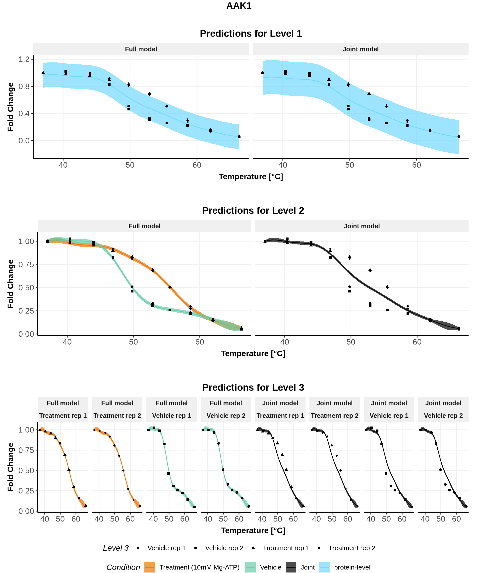
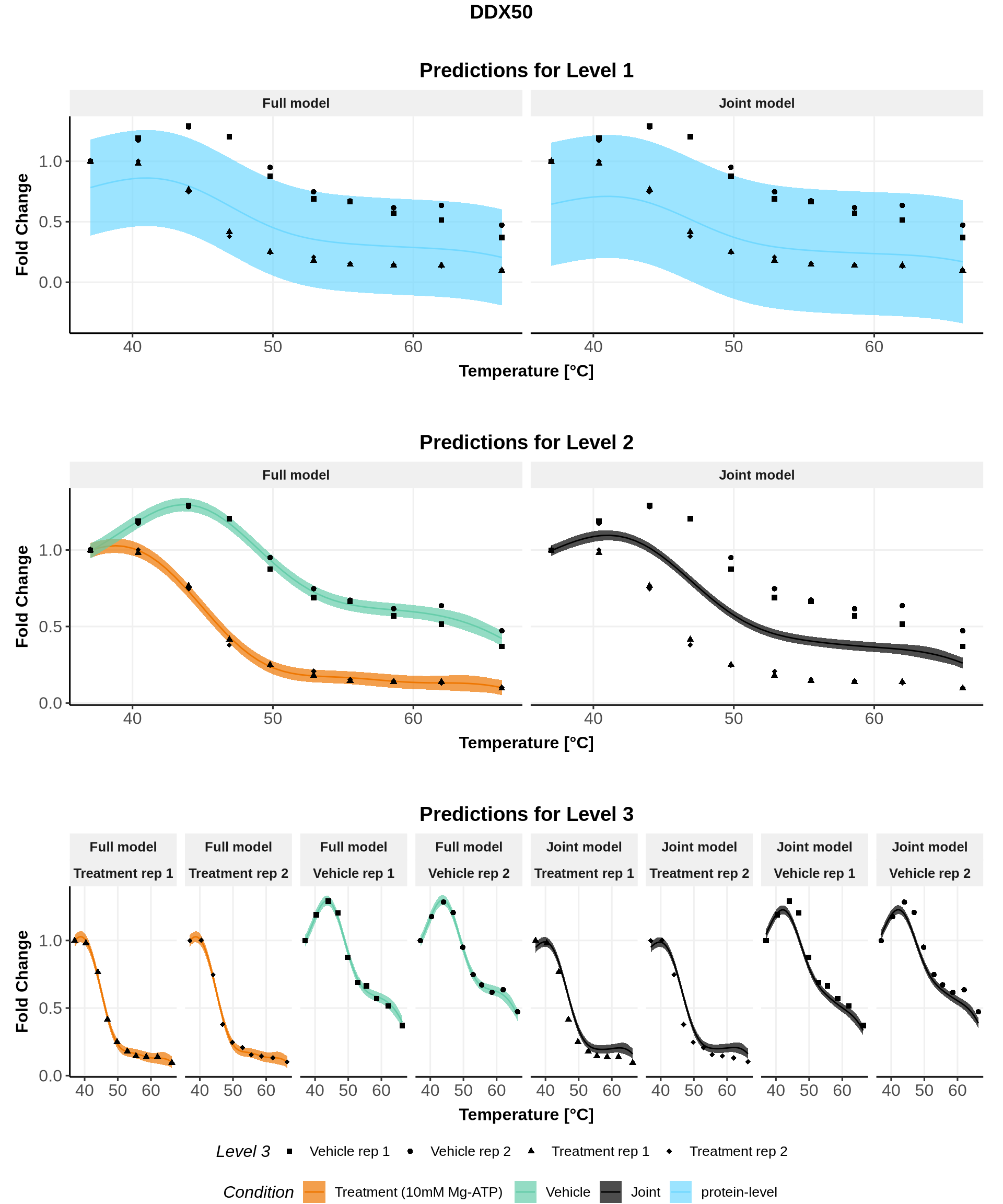
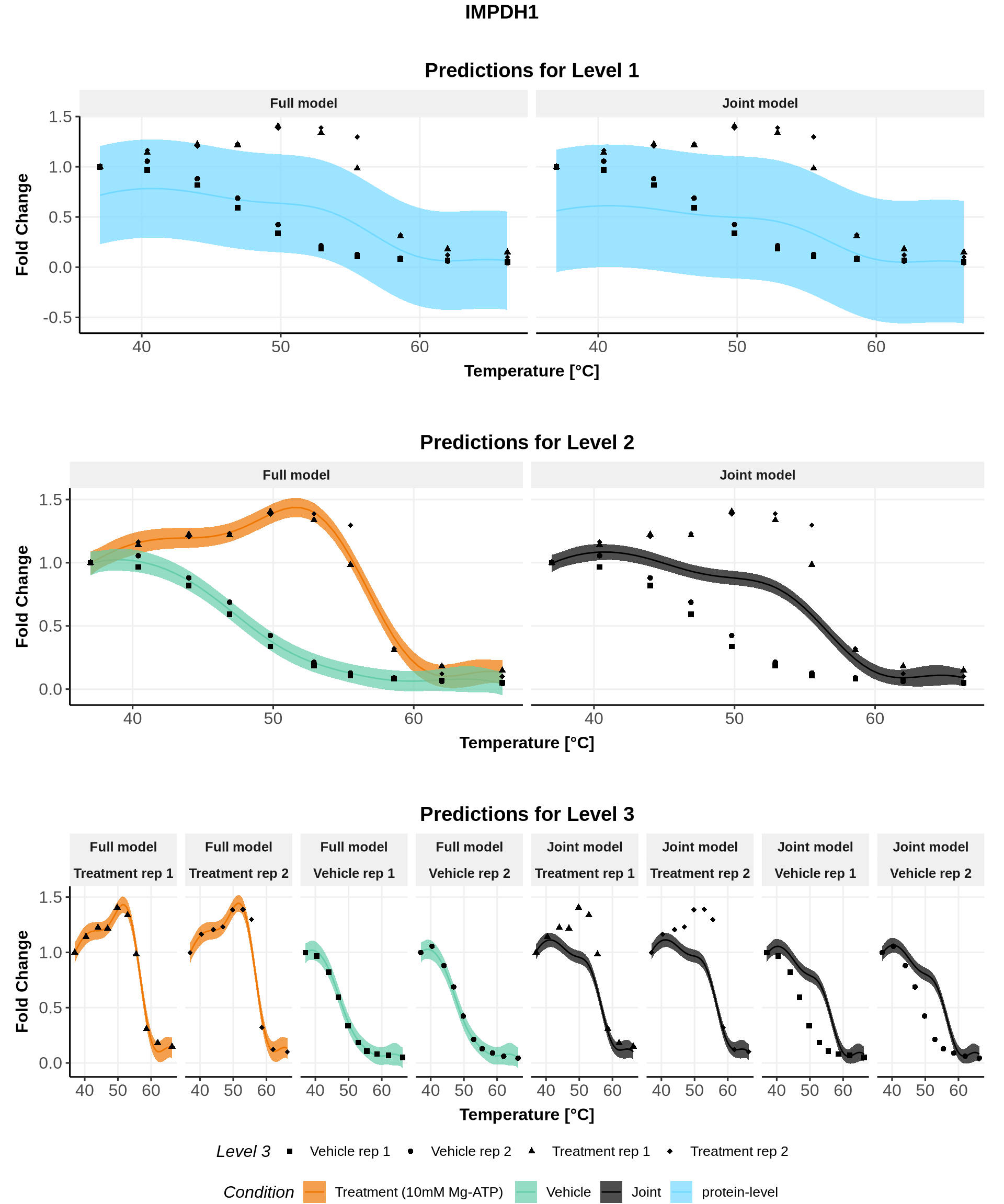
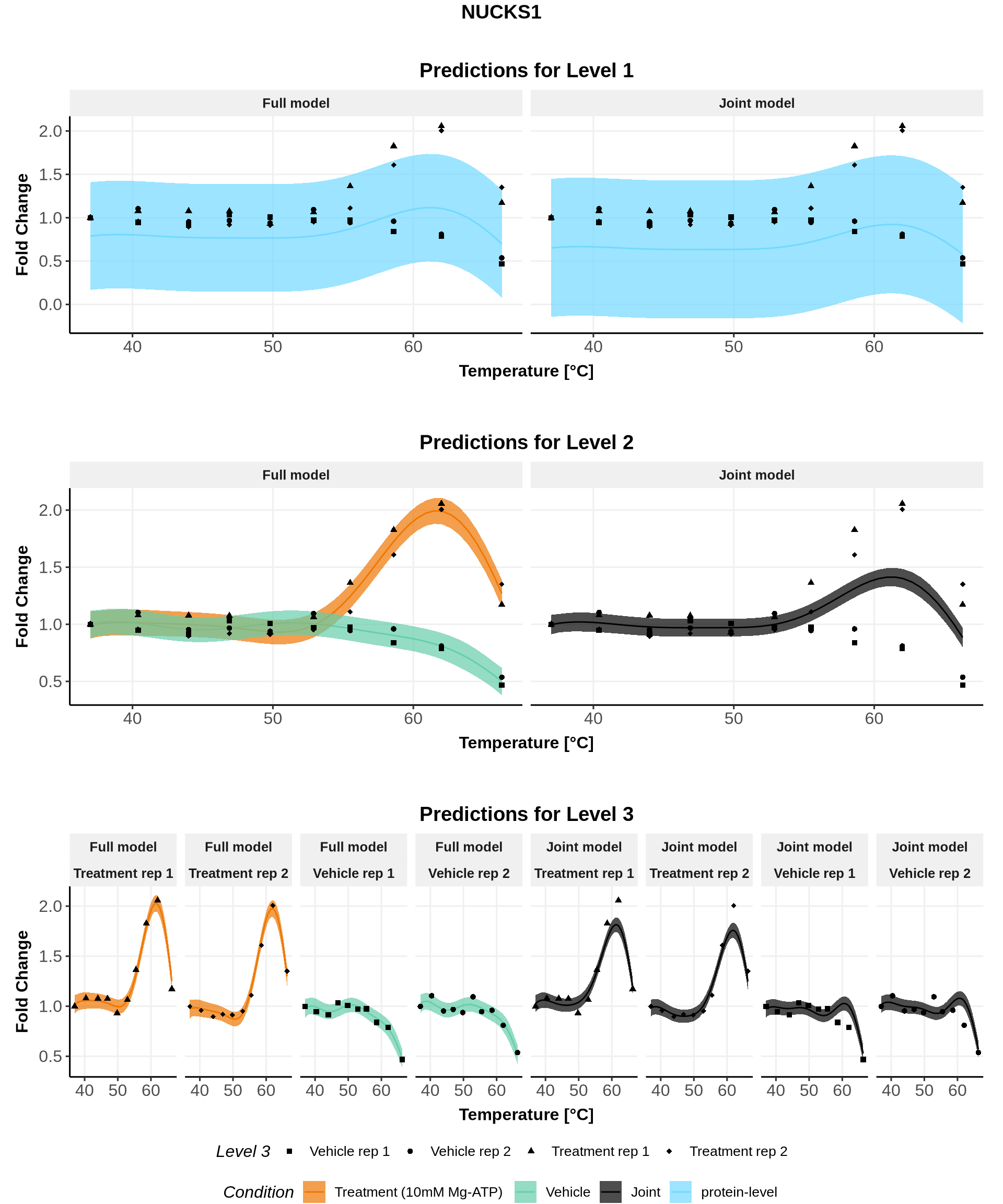
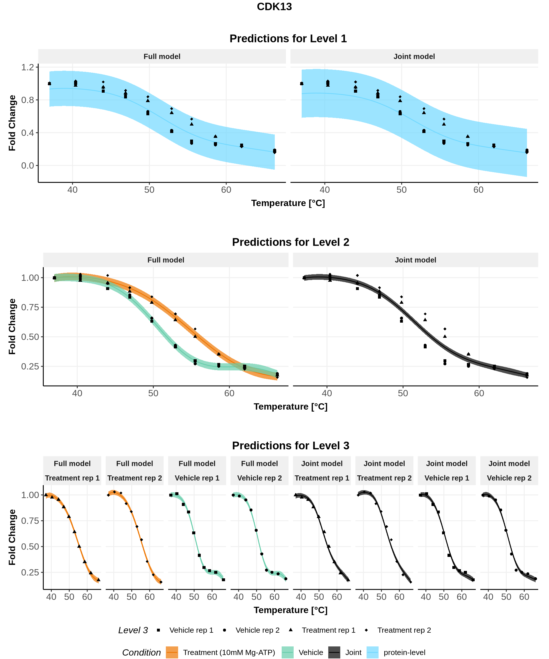
Having checked that the fits converged and that the \(\Lambda\) values are valid, we can now have a look at the fits. Especially, in our case, we have only 16 IDs so we can plot the fits for all of them. In general, you may be more interested in plotting the IDs with the largest \(\Lambda\) values and/or the smallest p-values.

The fits are directly provided as output of the Nextflow pipeline. Go in the folder Results_ATP2019/Plots and select a protein: the plot on the last page should represent the fits for all curves comparisons performed for this protein.

We explain here how we can plot the fits using the output files starting with prediction. If the selected hierarchical model has \(L\) levels, then you should find \(L\) files starting with prediction_full_hgpm_ and \(L\) files starting with prediction_joint_hgpm_.

4.1 General variables

Code
custom_labeller <- function(value) {
  paste0( Hmisc::capitalize(value), " model")
}

# create a list to store the plots of each level
all_plots <- vector(mode ="list", length = length(order_levels_1))
names(all_plots) <- order_levels_1

for(i in seq_along(order_levels_1)){
  
  all_plots[[i]] <- list("Level_1" = NA,
                         "Levels_1to2" = NA,
                         "Levels_1to3" = NA)
}

4.2 Top level of the hierarchy

We start by loading the datasets.

Code
prediction_full_hgpm_Level_1 <- read.csv("NextFlow/Results_ATP2019/prediction_full_hgpm_Level_1.csv") 

prediction_joint_hgpm_Level_1 <- read.csv("NextFlow/Results_ATP2019/prediction_joint_hgpm_Level_1.csv") 

# if some scaling has been computed, we load the scaled data
if(file.exists("NextFlow/Results_ATP2019/data_with_scalingFactors.csv")){
  
  real_dataset <- read.csv("NextFlow/Results_ATP2019/data_with_scalingFactors.csv") 
  
}else{
  # if no scaling has been computed, then we can use the input data
  real_dataset <- read.csv("NextFlow/dummy_data/ATP2019/dataForGPMelt.csv") 
  
}

We then combine them.

Code
prediction_hgpm_Level_1 <- rbind(
  prediction_joint_hgpm_Level_1 %>%
    dplyr::select(-comparison_id, -treatment_condition, - control_condition, -Level_1_ForNullHyp), 
  prediction_full_hgpm_Level_1
)

And we prepare the plot.

Code
for(lev1 in order_levels_1){
  
  all_plots[[lev1]][["Level_1"]] <- ggplot(prediction_hgpm_Level_1 %>%
           filter(Level_1 == lev1)%>%
            mutate(Level_2 = factor("protein-level", levels= c("10mM_Mg_ATP", "Vehicle", "joint_condition", "protein-level"))))+
  geom_line(mapping = aes(x=x, y=y, color=Level_2), show.legend = TRUE)+
  geom_ribbon(mapping = aes(x=x, 
                  ymin = conf_lower, 
                  ymax = conf_upper,
                  fill=Level_2), 
              show.legend = TRUE, 
              alpha=0.7)+
    geom_point(data = real_dataset %>% filter(Level_1 ==lev1),
               mapping=aes(x=x, y=y, shape = Level_3))+
  facet_grid(.~model, labeller = labeller(model = custom_labeller) )+
  scale_shape_manual(name = "Level 3",
                     values = c("Vehicle.1" = 15,
                                "Vehicle.2" = 16,
                                "10mM_Mg_ATP.1" = 17,
                                "10mM_Mg_ATP.2" = 18),
                     labels = c("Vehicle.1" = "Vehicle rep 1",
                                "Vehicle.2" = "Vehicle rep 2",
                                "10mM_Mg_ATP.1" = "Treatment rep 1",
                                "10mM_Mg_ATP.2" = "Treatment rep 2"), 
                     breaks= c("Vehicle.1", "Vehicle.2", "10mM_Mg_ATP.1", "10mM_Mg_ATP.2")
                     )+
  scale_color_manual(name="Condition",
                     values = c("10mM_Mg_ATP"="darkorange2",
                              "Vehicle" = "aquamarine3",
                              "joint_condition"="black", 
                              "protein-level"= "#72D8FF"
                              ),
                     labels= c("10mM_Mg_ATP" = "Treatment (10mM Mg-ATP)",
                             "Vehicle"="Vehicle",
                             "joint_condition"="Joint", 
                             "protein-level"= "protein-level"
                              ),
                     breaks = c("10mM_Mg_ATP", "Vehicle", "joint_condition", "protein-level"),
                     drop=FALSE)+
  scale_fill_manual(name="Condition",
                   values = c("10mM_Mg_ATP"="darkorange2",
                            "Vehicle" = "aquamarine3",
                            "joint_condition"="black", 
                            "protein-level"= "#72D8FF"
                            ),
                   labels= c("10mM_Mg_ATP" = "Treatment (10mM Mg-ATP)",
                           "Vehicle"="Vehicle",
                           "joint_condition"="Joint",
                            "protein-level"= "protein-level"
                            ),
                   breaks =c("10mM_Mg_ATP", "Vehicle", "joint_condition", "protein-level"),
                   drop=FALSE)+
  guides(shape=guide_legend(nrow = 1, byrow=FALSE, override.aes=list(fill=NA, linetype= 0)))+
  xlab("Temperature [°C]")+
  xlab("Temperature [°C]")+
  ylab("Fold Change")+
  #ggtitle("", subtitle= "Prediction for Level 1")+
  theme_Publication(base_size = 12)+
  theme(legend.box="vertical", 
        legend.margin=margin(),
        legend.text = element_text(size=10))
        #aspect.ratio = 0.8)

}

4.3 Second level of the hierarchy

We start by loading the datasets.

Code
prediction_full_hgpm_Levels_1to2 <- read.csv("NextFlow/Results_ATP2019/prediction_full_hgpm_Levels_1to2.csv") 

prediction_joint_hgpm_Levels_1to2 <- read.csv("NextFlow/Results_ATP2019/prediction_joint_hgpm_Levels_1to2.csv") 

We then combine them.

Code
prediction_hgpm_Levels_1to2 <- rbind(
  prediction_joint_hgpm_Levels_1to2 %>%
    dplyr::select(-comparison_id, -treatment_condition, - control_condition, -Level_1_ForNullHyp), 
  prediction_full_hgpm_Levels_1to2
)

And we prepare the plot.

Code
for(lev1 in order_levels_1){
  
  all_plots[[lev1]][["Levels_1to2"]] <- 
    ggplot(prediction_hgpm_Levels_1to2 %>%
           filter(Level_1 == lev1) %>%
             mutate(Level_2 = factor(Level_2, levels= c("10mM_Mg_ATP", "Vehicle", "joint_condition", "protein-level"))))+
  geom_line(mapping = aes(x=x, y=y, color=Level_2))+
  geom_ribbon(mapping = aes(x=x, 
                  ymin = conf_lower, 
                  ymax = conf_upper, 
                  fill=Level_2), 
              alpha=0.7)+
    geom_point(data = real_dataset %>% filter(Level_1 ==lev1),
               mapping=aes(x=x, y=y, shape = Level_3))+
  facet_grid(.~model, labeller = labeller(model = custom_labeller) )+
  scale_shape_manual(name = "Level 3",
                     values = c("Vehicle.1" = 15,
                                "Vehicle.2" = 16,
                                "10mM_Mg_ATP.1" = 17,
                                "10mM_Mg_ATP.2" = 18),
                     labels = c("Vehicle.1" = "Vehicle rep 1",
                                "Vehicle.2" = "Vehicle rep 2",
                                "10mM_Mg_ATP.1" = "Treatment rep 1",
                                "10mM_Mg_ATP.2" = "Treatment rep 2"), 
                     breaks= c("Vehicle.1", "Vehicle.2", "10mM_Mg_ATP.1", "10mM_Mg_ATP.2")
                     )+
  scale_color_manual(name="Condition",
                     values = c("10mM_Mg_ATP"="darkorange2",
                              "Vehicle" = "aquamarine3",
                              "joint_condition"="black", 
                              "protein-level"= "#72D8FF"
                              ),
                     labels= c("10mM_Mg_ATP" = "Treatment (10mM Mg-ATP)",
                             "Vehicle"="Vehicle",
                             "joint_condition"="Joint", 
                             "protein-level"= "protein-level"
                              ),
                     breaks = c("10mM_Mg_ATP", "Vehicle", "joint_condition", "protein-level"),
                     drop=FALSE)+
  scale_fill_manual(name="Condition",
                   values = c("10mM_Mg_ATP"="darkorange2",
                            "Vehicle" = "aquamarine3",
                            "joint_condition"="black", 
                            "protein-level"= "#72D8FF"
                            ),
                   labels= c("10mM_Mg_ATP" = "Treatment (10mM Mg-ATP)",
                           "Vehicle"="Vehicle",
                           "joint_condition"="Joint",
                            "protein-level"= "protein-level"
                            ),
                   breaks =c("10mM_Mg_ATP", "Vehicle", "joint_condition", "protein-level"),
                   drop=FALSE)+
  guides(shape=guide_legend(nrow = 1, byrow=FALSE))+
  xlab("Temperature [°C]")+
  ylab("Fold Change")+
  #ggtitle("", subtitle= "Prediction for Level 2")+
  theme_Publication(base_size = 12)+
  theme(legend.box="vertical", 
        legend.margin=margin(),
        legend.text = element_text(size=10))
        #aspect.ratio = 0.8)
  
  
}

4.4 Last level of the hierarchy (leaves)

We start by loading the datasets.

Code
prediction_full_hgpm_Levels_1to3 <- read.csv("NextFlow/Results_ATP2019/prediction_full_hgpm_Levels_1to3.csv") 

prediction_joint_hgpm_Levels_1to3 <- read.csv("NextFlow/Results_ATP2019/prediction_joint_hgpm_Levels_1to3.csv") 

We then combine them.

Code
prediction_hgpm_Levels_1to3 <- rbind(
  prediction_joint_hgpm_Levels_1to3 %>%
    dplyr::select(-comparison_id, -treatment_condition, - control_condition, -Level_1_ForNullHyp), 
  prediction_full_hgpm_Levels_1to3
)

And we prepare the plot.

Code
Level_3_labeller <- c("Vehicle.1" = "Vehicle rep 1",
                      "Vehicle.2" = "Vehicle rep 2",
                      "10mM_Mg_ATP.1" = "Treatment rep 1",
                      "10mM_Mg_ATP.2" = "Treatment rep 2")


for(lev1 in order_levels_1){
  
  all_plots[[lev1]][["Levels_1to3"]] <- 
    ggplot(prediction_hgpm_Levels_1to3 %>%
           filter(Level_1 == lev1) %>%
             mutate(Level_2 = factor(Level_2, levels= c("10mM_Mg_ATP", "Vehicle", "joint_condition", "protein-level"))))+
  geom_line(mapping = aes(x=x, y=y, color=Level_2), show.legend = TRUE)+
  geom_ribbon(mapping = aes(x=x, 
                  ymin = conf_lower, 
                  ymax = conf_upper, 
                  fill=Level_2), 
              alpha=0.7, show.legend = TRUE)+
    geom_point(data = real_dataset %>% filter(Level_1 ==lev1),
               mapping=aes(x=x, y=y, shape = Level_3))+
  facet_grid(.~ model + Level_3,
             labeller = labeller(model = custom_labeller, 
                                 Level_3 = Level_3_labeller) )+
  scale_shape_manual(name = "Level 3",
                     values = c("Vehicle.1" = 15,
                                "Vehicle.2" = 16,
                                "10mM_Mg_ATP.1" = 17,
                                "10mM_Mg_ATP.2" = 18),
                     labels = c("Vehicle.1" = "Vehicle rep 1",
                                "Vehicle.2" = "Vehicle rep 2",
                                "10mM_Mg_ATP.1" = "Treatment rep 1",
                                "10mM_Mg_ATP.2" = "Treatment rep 2"), 
                     breaks= c("Vehicle.1", "Vehicle.2", "10mM_Mg_ATP.1", "10mM_Mg_ATP.2")
                     )+
  scale_color_manual(name="Condition",
                     values = c("10mM_Mg_ATP"="darkorange2",
                              "Vehicle" = "aquamarine3",
                              "joint_condition"="black", 
                              "protein-level"= "#72D8FF"
                              ),
                     labels= c("10mM_Mg_ATP" = "Treatment (10mM Mg-ATP)",
                             "Vehicle"="Vehicle",
                             "joint_condition"="Joint", 
                             "protein-level"= "protein-level"
                              ),
                     breaks = c("10mM_Mg_ATP", "Vehicle", "joint_condition", "protein-level"),
                     drop=FALSE)+
  scale_fill_manual(name="Condition",
                   values = c("10mM_Mg_ATP"="darkorange2",
                            "Vehicle" = "aquamarine3",
                            "joint_condition"="black", 
                            "protein-level"= "#72D8FF"
                            ),
                   labels= c("10mM_Mg_ATP" = "Treatment (10mM Mg-ATP)",
                           "Vehicle"="Vehicle",
                           "joint_condition"="Joint",
                            "protein-level"= "protein-level"
                            ),
                   breaks =c("10mM_Mg_ATP", "Vehicle", "joint_condition", "protein-level"),
                   drop=FALSE)+
  guides(shape=guide_legend(nrow = 1, byrow=FALSE, override.aes=list(fill=NA, linetype= 0)))+
  xlab("Temperature [°C]")+
  ylab("Fold Change")+
  #ggtitle("", subtitle= "Prediction for Level 3")+
  theme_Publication(base_size = 12)+
  theme(legend.box="vertical", 
        legend.margin=margin(),
        legend.text = element_text(size=10))
        #aspect.ratio = 1)

}

4.5 Plotting all levels together

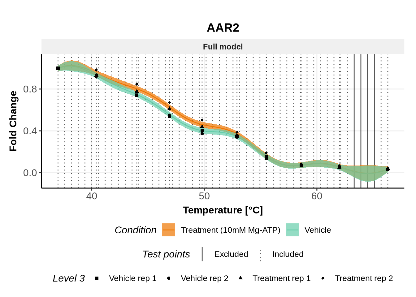
We will only plot the fits for the 5 IDs with the largest \(\Lambda\) values, but don’t hesitate to explore all fits!

In these plots, we represent on the left the predictions obtained with the full model \(\mathcal{M}_1\) and on the right the prediction obtained with the joint model \(\mathcal{M}_0\).

Note: For both models, the parameters are the ones estimated for \(\mathcal{M}_1\)(for advanced users: see (Le Sueur, Rattray, and Savitski 2024) for an explanation).

Code
for(lev1 in order_levels_1[c(1:5)]){

   full_hierarchy <- ggarrange(
     all_plots[[lev1]][["Level_1"]] + ggtitle("Predictions for Level 1"),
            all_plots[[lev1]][["Levels_1to2"]]+ ggtitle("Predictions for Level 2"),
            all_plots[[lev1]][["Levels_1to3"]]+ ggtitle("Predictions for Level 3"),
            ncol=1, nrow=3, common.legend = TRUE, legend="bottom") 
  
  print(annotate_figure(full_hierarchy, top = text_grob(lev1,face = "bold", size = 14)))
  
}

5 Area between the curves

While the p-values indicate which changes are reproducible, the effect size might be of interest to biologists wishing to perform follow-up experiments.

Because the formerly used \(\Delta T_m = T_m^{\text{treatment}} - T_m^{\text{control}}\) (e.g. in the melting point analysis (Savitski et al. 2014) and NPARC (Childs et al. 2019)) is only valid for sigmoidal curves, we extend the definition of the effect size to any melting curve shapes, and any number of intersection points between the curves.

The thermal stabilisation (destabilisation) effect is thus only defined for cases where the treatment (control) melting curve remains uniformly above the other.

We discussed here that:

  • the mean of the posterior distribution for the condition level (here Level 2) of the full model (\(\mathcal{M}_1\)) can be used as proxy for the melting curve fit,
  • and the \(95\%\) confidence region inform on the certainty of this fit.

While we do not extrapolate the melting curves beyond the range \([T_{min}, T_{max}]\), missing observations within this range can introduce more uncertainty in certain temperature intervals. To address this, we propose incorporating the \(95\%\) confidence region into the ABC computation as explained in the next section.

5.1 Leveraging the information of the \(95\%\) confidence region

We will proceed as follows:

  1. For the test points \(T^{*}\) (points in which the predictions are computed), calculate the median uncertainty for each condition of the protein, defined as the median of the differences between the upper and lower bounds of the \(95\%\) confidence region across all test points \(T^{*}\).
  2. At any test point, if the difference between the upper and lower bounds of the \(95\%\) confidence region exceeds twice the median uncertainty, treat the predicted value of the fit (i.e of the mean) at this temperature as too uncertain, considering the posterior mean as not sufficiently reliable.
  3. Exclude the union of these points (from both conditions being compared through the ABC) from the test points and compute the ABC using only the remaining, more reliable points.

Note: the \(95\%\) confidence region is provided in the prediction files, with variables conf_lower (lower bound of the \(95\%\) confidence region) and conf_upper (upper bound of the \(95\%\) confidence region). The posterior mean is given by the variable y in these files.

Code
CoeffUncertainty = 2 # you can increase this if you want to include only extremely reliable predictions

RegionOfAcceptableUncertainty <- prediction_full_hgpm_Levels_1to2 %>%
  mutate(Uncertainty = abs(conf_upper-conf_lower)) %>%
  group_by(Level_1, Level_2) %>%
  mutate(MedianUncertainty = median(Uncertainty)) %>%
  mutate(KeptTemperature = (Uncertainty <= CoeffUncertainty*MedianUncertainty ) ) %>%
  mutate(Diff = c(0, diff(KeptTemperature))) 

index2 =  c(1,which(RegionOfAcceptableUncertainty$Diff != 0), nrow(RegionOfAcceptableUncertainty)+1)
RegionOfAcceptableUncertainty$grp = rep(1:length(diff(index2)), diff(index2))

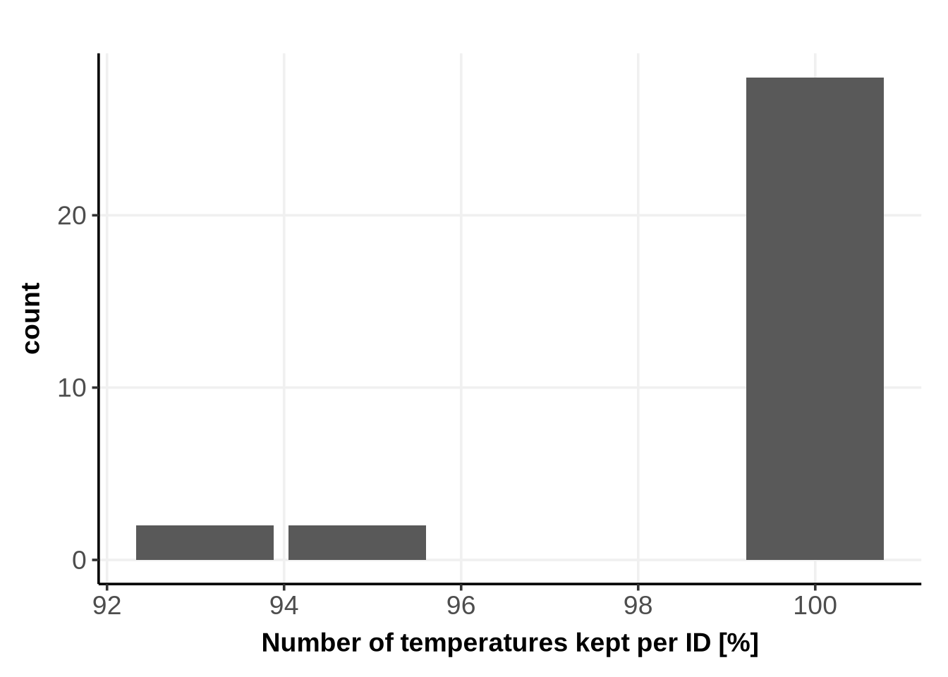
The following plot shows how many temperatures (in percentage) are defined as “certain enough” for the subsequent ABC computation:

Code
RegionOfAcceptableUncertainty_N_temp <- RegionOfAcceptableUncertainty %>%
  group_by(Level_1, Level_2)%>%
  distinct() %>%
  summarise(N_temp_kept = sum(KeptTemperature),
            N_temp_total = n_distinct(x)) 
Code
RegionOfAcceptableUncertainty_N_temp %>%
  ggplot()+
  geom_bar(
    aes(x = 100* (N_temp_kept/N_temp_total))
  )+
  xlab("Number of temperatures kept per ID [%]")+
  theme_Publication()

Below are example of proteins for which some temperatures (represented by a vertical line) have been excluded from the ABC computation:

Code
for(lev1 in c("AAR2","AAK1") ){
 
  gg <-ggplot(prediction_full_hgpm_Levels_1to2 %>%
             filter(Level_1 == lev1))+
    # Test points definitions
    geom_vline(data= RegionOfAcceptableUncertainty %>% 
                 filter(Level_1==lev1) ,
               mapping=aes(xintercept=x, linetype=KeptTemperature), color = "black", alpha =0.7)+
    # condition-level fits
    geom_line(mapping = aes(x=x, y=y, color=Level_2))+
    geom_ribbon(mapping = aes(x=x, 
                    ymin = conf_lower, 
                    ymax = conf_upper, 
                    fill=Level_2), 
                alpha=0.7)+
    # real data
    geom_point(data = real_dataset %>% filter(Level_1 ==lev1),
               mapping=aes(x=x, y=y, shape = Level_3))+
    facet_grid(.~model, labeller = labeller(model = custom_labeller) )+
    scale_shape_manual(name = "Level 3",
                       values = c("Vehicle.1" = 15,
                                  "Vehicle.2" = 16,
                                  "10mM_Mg_ATP.1" = 17,
                                  "10mM_Mg_ATP.2" = 18),
                       labels = c("Vehicle.1" = "Vehicle rep 1",
                                  "Vehicle.2" = "Vehicle rep 2",
                                  "10mM_Mg_ATP.1" = "Treatment rep 1",
                                  "10mM_Mg_ATP.2" = "Treatment rep 2"), 
                       breaks= c("Vehicle.1", "Vehicle.2", "10mM_Mg_ATP.1", "10mM_Mg_ATP.2")
                       )+
    scale_color_manual(name="Condition",
                       values = c("10mM_Mg_ATP"="darkorange2",
                                "Vehicle" = "aquamarine3",
                                "joint_condition"="black", 
                                "protein-level"= "#72D8FF"
                                ),
                       labels= c("10mM_Mg_ATP" = "Treatment (10mM Mg-ATP)",
                               "Vehicle"="Vehicle",
                               "joint_condition"="Joint", 
                               "protein-level"= "protein-level"
                                ),
                       breaks = c("10mM_Mg_ATP", "Vehicle", "joint_condition", "protein-level"),
                       drop=FALSE)+
    scale_fill_manual(name="Condition",
                     values = c("10mM_Mg_ATP"="darkorange2",
                              "Vehicle" = "aquamarine3",
                              "joint_condition"="black", 
                              "protein-level"= "#72D8FF"
                              ),
                     labels= c("10mM_Mg_ATP" = "Treatment (10mM Mg-ATP)",
                             "Vehicle"="Vehicle",
                             "joint_condition"="Joint",
                              "protein-level"= "protein-level"
                              ),
                     breaks =c("10mM_Mg_ATP", "Vehicle", "joint_condition", "protein-level"),
                     drop=FALSE)+
    guides(shape=guide_legend(nrow = 1, byrow=FALSE))+
    scale_linetype_manual(
           name ="Test points",
           values = c("TRUE"= "dotted",
                    "FALSE" = "solid"),
           labels = c("TRUE"=  "Included",
                    "FALSE" = "Excluded")
         )+
    xlab("Temperature [°C]")+
    ylab("Fold Change")+
    ggtitle(lev1)+
    theme_Publication(base_size = 12)+
    theme(legend.box="vertical", 
          legend.margin=margin(),
          legend.text = element_text(size=10), 
          ratio =0.6)

   print(gg)
  }

5.2 Compute the Area Between the Curves (ABC)

We propose to compute two different effect sizes: the absolute and signed ABC.

Indeed, the melting curves of two conditions can cross one to multiple times.

In this case, the signed ABC might be close to 0 (positive and negative area cancelling each other), but the absolute area between the curves will be large (see Section 8).

The signed ABC is useful if one is interested in the main direction of changes, i.e., primarily “destabilised” or “stabilised”.

Code
data_for_ABC_computation <- inner_join( # we need inner_join to only keep the temperatures which are present in both the control and the TTT
  
    # correspond to the fit of the control condition
    RegionOfAcceptableUncertainty %>%
      inner_join(data.frame(Level_2="Vehicle")) %>%
      filter(KeptTemperature)%>%
      dplyr::select(Level_1 , Level_2, x, y) , 
    # correspond to the fit of the TTT condition
     RegionOfAcceptableUncertainty %>%
      anti_join(data.frame(Level_2="Vehicle")) %>%
      filter(KeptTemperature) %>%
      dplyr::select(Level_1 , Level_2, x, y) , 
    by=c("Level_1", "x"), 
    suffix = c("_Vehicle", "_TTT")
    ) %>% distinct() # remove repeated temperatures like the first and last. 
  
  ######## final number of temperatures kept for ABC computation ######## 
  N_temp <- data_for_ABC_computation %>%
    group_by(Level_1)%>%
    distinct() %>%
    summarise(N_temp_kept = n_distinct(x)) %>%
    mutate(N_temp_total = unique(RegionOfAcceptableUncertainty_N_temp$N_temp_total))
  
  ######## absolute ABC   ######## 
  abs_ABC <- data_for_ABC_computation %>%
  # compute the abs diff between these fits, at temperatures at which both fits are certain
  mutate(Abs_diff = abs(y_Vehicle-y_TTT)) %>%
  dplyr::rename("Temperature"="x") %>%
  group_by(Level_1) %>%
  # approximate the integral from it
  group_modify(~ComputeIntegral(.x, .y),.keep = TRUE) %>%
  ungroup()
  
  ######## signed ABC   ######## 
  signed_ABC <- data_for_ABC_computation %>%
  # compute the diff between these fits, at temperatures at which both fits are certain
  mutate(Abs_diff = y_TTT-y_Vehicle) %>% # the name here is just for the use of ComputeIntegral
  dplyr::rename("Temperature"="x") %>%
  group_by(Level_1) %>%
  # compute the integral from it
  group_modify(~ComputeIntegral(.x, .y),.keep = TRUE) %>%
  ungroup()
  
  ######## combined signed and full   ######## 
  ABC <- full_join(
   abs_ABC %>% dplyr::rename("abs_ABC"= "SimpsonInt"),
   signed_ABC %>% dplyr::rename("signed_ABC"= "SimpsonInt")
  ) %>% full_join(N_temp)
  
  head(ABC)
# A tibble: 6 × 5
  Level_1 abs_ABC signed_ABC N_temp_kept_for_ABC_comput…¹ N_temp_total_for_ABC…²
  <chr>     <dbl>      <dbl>                        <int>                  <int>
1 AAGAB    0.863     -0.861                            58                     58
2 AAK1     3.39       2.97                             55                     58
3 AAMDC    0.0153     0.0118                           58                     58
4 AAMP     1.60      -1.21                             58                     58
5 AAR2     0.757      0.757                            54                     58
6 BANF1   21.0      -20.8                              58                     58
# ℹ abbreviated names: ¹​N_temp_kept_for_ABC_computation,
#   ²​N_temp_total_for_ABC_computation

5.3 Add the ABC to the results

Code
p_values_subset <- full_join(
  p_values_subset,
  ABC, 
  by= "Level_1"
)

head(p_values_subset)
    job_id Level_1       comparison_id treatment_condition control_condition
1 job_id_1    AAR2 10mM_Mg_ATP-Vehicle         10mM_Mg_ATP           Vehicle
2 job_id_1   BANF1 10mM_Mg_ATP-Vehicle         10mM_Mg_ATP           Vehicle
3 job_id_1   CDK13 10mM_Mg_ATP-Vehicle         10mM_Mg_ATP           Vehicle
4 job_id_1   DDX50 10mM_Mg_ATP-Vehicle         10mM_Mg_ATP           Vehicle
5 job_id_2    DPM1 10mM_Mg_ATP-Vehicle         10mM_Mg_ATP           Vehicle
6 job_id_2   EIF3H 10mM_Mg_ATP-Vehicle         10mM_Mg_ATP           Vehicle
  loss_joint_model loss_full_model LikelihoodRatio
1       -1.6057984      -1.7392089      0.26682115
2        0.9524714       0.8370557      0.23083150
3        0.1378285      -1.6354157      3.54648843
4       10.1445894      -1.1290801     22.54733896
5       -0.7899789      -0.8318957      0.08383369
6       -0.6087869      -1.0462550      0.87493622
  size_null_distribution_approximation
1                                  160
2                                  160
3                                  160
4                                  160
5                                  160
6                                  160
  n_values_as_extreme_in_null_distribution_approximation     pValue    abs_ABC
1                                                      2 0.01863354  0.7572629
2                                                      2 0.01863354 21.0061285
3                                                      0 0.00621118  2.7098073
4                                                      0 0.00621118 13.5797067
5                                                     12 0.08074534  1.8002684
6                                                      1 0.01242236  2.6793808
   signed_ABC N_temp_kept_for_ABC_computation N_temp_total_for_ABC_computation
1   0.7572629                              54                               58
2 -20.8278484                              58                               58
3   2.4401069                              58                               58
4 -13.5776990                              58                               58
5  -1.7703910                              58                               58
6  -2.5859691                              58                               58

6 p-values

The p-value computed from the subset of 16 IDs cannot be used here, because we used a dataset_wise approximation with 10 samples per IDs only, leading to a null distribution approximation of size \(16 \times 10 = 160\). This is too little for a reliable estimate of the p-values.

Instead, for the sake of the example, we propose to use the published p-values.

We first recompute the BH adjusted p-values while considering all proteins in the dataset.

p_values_fulldataset <- p_values_fulldataset %>%
  mutate(p_adj = p.adjust(pValue, method = "BH")) 

Consequently, we subset p_values_fulldataset to only the 16 IDs of interest and merge the pvalues and adjusted p-values with the Nextflow results.

Code
p_values_df <- left_join(
  # remove the p-values computed from the subset
  p_values_subset %>%
    dplyr::select(-pValue, -size_null_distribution_approximation, -n_values_as_extreme_in_null_distribution_approximation),
  # add p-values computed on the full dataset, using 10 samples per ID and 4772 IDs.
  p_values_fulldataset %>% dplyr::select(Level_1, pValue, size_null_distribution_approximation, n_values_as_extreme_in_null_distribution_approximation, p_adj)
)

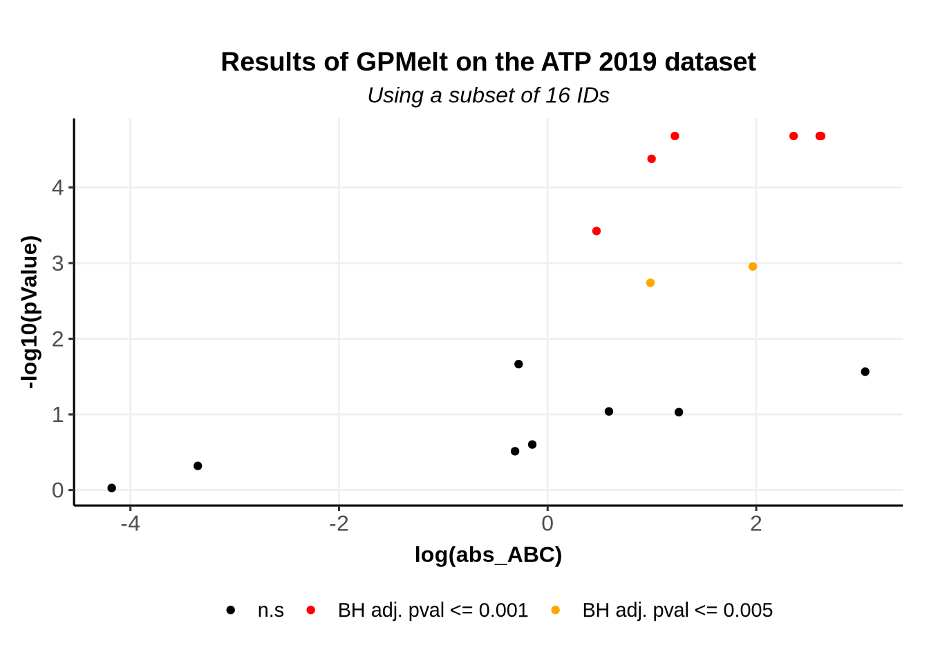
7 Volcano-like plots

We previously have computed the effect size, and have a measure of significance thanks to \(\Lambda\) and the p-values. We can plot these information in a Volcano plot, which typically represents the effect size and the p-values.

Code
BaseSize=12
th1=0.001
th2=0.005

VolcanoPlot <- ggplot(p_values_df )+
  geom_point(aes(x = log(abs_ABC), 
                 y= -log10(pValue), 
                 color = ifelse(p_adj<=th1, "th1", ifelse(p_adj<=th2, "th2", "n.s")) , text = Level_1 ))+
  scale_color_manual(name = "", 
                     values= c("th1"="red",
                               "th2"="orange",
                               "n.s"="black"),
                     labels = c("th1"=paste0("BH adj. pval <= ",th1 ),
                               "th2"=paste0("BH adj. pval <= ",th2 ),
                               "n.s"="n.s"))+
  ggtitle("Results of GPMelt on the ATP 2019 dataset",
          subtitle = "Using a subset of 16 IDs")+
  theme_Publication(base_size = BaseSize)

print(VolcanoPlot)

8 A comparison between the absolute ABC and the signed ABC

We demonstrate here why these two metrics of the effect size are useful.

Using the published ABC computations saved on DOI, under the name ATP2019/prerun/ABC_perID.rds, we add to our subset of 16 IDs the proteins RPLP0 and RPL5 and their p-values.

ABC_published <- read_rds(file = "Analysis/ATP2019/prerun/ABC_perID.rds")
Fits_published <- read_rds(file = "Analysis/ATP2019/GPMelt_results/Predictions_Levels1to2_RealDataset.rds") 
Code
ABC <- full_join(
  ABC, 
  ABC_published %>% 
    dplyr::filter(Level_1 %in% c("RPLP0", "RPL5")) %>%
    dplyr::select(-X) %>%
    dplyr::rename("N_temp_kept_for_ABC_computation" = "N_temp_kept",
                  "N_temp_total_for_ABC_computation"= "N_temp_total")
) %>% left_join(
  p_values_fulldataset %>% dplyr::select(Level_1, p_adj)
)

We also need the fits and the observations for these proteins.

Fits_published <- read_rds(file = "Analysis/ATP2019/GPMelt_results/Predictions_Levels1to2_RealDataset.rds") 
real_dataset_published <-  read_rds(file = "Analysis/ATP2019/GPMelt_results/GPMelt_inputDataset.rds")
Code
real_dataset_published <- real_dataset_published %>% 
  mutate(rep = as.character(rep), # rep is a character in real_dataset
         Level_3 = gsub("rep", "", Level_3)) # the names fo Level3 are slightly different.

We start by plotting the ABC vs the absolute ABC.

Code
BaseSize=12

DiffInABC <- ggplot(ABC)+
   geom_abline(slope=1, linetype="dotted")+
   geom_abline(slope=-1, linetype="dotted")+
  geom_point(aes(x=signed_ABC, y=abs_ABC, color = -log10(p_adj) ), size=3)+
  geom_label_repel(data= ABC %>%
                     filter(Level_1 %in% c("RPL5",  "RPLP0", "DDX50", "IMPDH1")) %>% 
                     distinct() ,
                   aes(x=signed_ABC, y=abs_ABC, label= Level_1), min.segment.length = 10, size =BaseSize/2)+
   scale_color_viridis(direction=-1, option="magma", na.value ="black",
                      name =  latex2exp::TeX("$-\\log_{10}$(adj p-value)"))+
  xlab(latex2exp::TeX("$ABC_{GPMelt}$"))+
  ylab(latex2exp::TeX("$|ABC|_{GPMelt}$"))+
  theme_Publication(base_size = BaseSize)

print(DiffInABC)

As can be seen from this plot, some IDs lie on the dotted lines.

These dotted lines represent \(y=-x\) (left) and \(y=x\) (right).

  • IDs for which the points \((ABC, |ABC|)\) lies close to the line \(y=x\) are IDs for which the treatment condition remains (almost perfectly) uniformly above the control condition. We can talk about a stabilization effect of the treatment. This is the case of IMPDH1 (see figure below).

  • IDs for which the points \((ABC, |ABC|)\) lies close to the line \(y=-x\) are IDs for which the treatment condition remains (almost perfectly) uniformly below the control condition. We can talk about a destabilization effect of the treatment. This is the case of DDX50 (see figure below).

  • IDs with x values close to \(0\) but y values far from \(0\) correspond to IDs that would likely be overlooked if we would only use the \(ABC\)! If the \(ABC\) is about \(0\) but the \(|ABC|\) is large, then this means that the treatment and control conditions cross at least once (see RPL5 and RPLP0). This also means that at least one of these curves is likely non-sigmoidal. Defining the \(|ABC|\) makes it possible to notice these proteins with interesting patterns! Hence, do always use the \(|ABC|\) in your volcano plots!!

Note: As exemplified below with IMPDH1 and DDX50, non-sigmoidal melting curves can also be observed without any crossing of the melting curves!

Code
levels1 <- c("RPL5",  "RPLP0", "DDX50", "IMPDH1")

ExamplesABC <- ggplot(
  data = rbind(
    prediction_full_hgpm_Levels_1to2 %>%
      dplyr::select(-Index_Level_1, -Index_Level_2, -job_id), 
    Fits_published %>%
      anti_join(data.frame(Level_2="joint")) %>%
      mutate(model = "full", 
            predicted_levels = "Levels_1to2" )
    ) %>% filter(Level_1 %in% levels1))+
  geom_line(mapping = aes(x=x, y=y, color=Level_2))+
  geom_ribbon(mapping = aes(x=x, 
                  ymin = conf_lower, 
                  ymax = conf_upper, 
                  fill=Level_2), 
              alpha=0.7)+
    geom_point(data = full_join(
      real_dataset_published %>% 
        filter(Level_1  %in% c("RPL5",  "RPLP0")),
      real_dataset %>% filter(Level_1  %in% c("DDX50", "IMPDH1"))
    ),
    mapping=aes(x=x, y=y, shape = Level_3))+
  facet_grid(.~model, labeller = labeller(model = custom_labeller) )+
  scale_shape_manual(name = "Level 3",
                     values = c("Vehicle.1" = 15,
                                "Vehicle.2" = 16,
                                "10mM_Mg_ATP.1" = 17,
                                "10mM_Mg_ATP.2" = 18),
                     labels = c("Vehicle.1" = "Vehicle rep 1",
                                "Vehicle.2" = "Vehicle rep 2",
                                "10mM_Mg_ATP.1" = "Treatment rep 1",
                                "10mM_Mg_ATP.2" = "Treatment rep 2"), 
                     breaks= c("Vehicle.1", "Vehicle.2", "10mM_Mg_ATP.1", "10mM_Mg_ATP.2")
                     )+
  scale_color_manual(name="Condition",
                     values = c("10mM_Mg_ATP"="darkorange2",
                              "Vehicle" = "aquamarine3",
                              "joint_condition"="black", 
                              "protein-level"= "#72D8FF"
                              ),
                     labels= c("10mM_Mg_ATP" = "Treatment (10mM Mg-ATP)",
                             "Vehicle"="Vehicle",
                             "joint_condition"="Joint", 
                             "protein-level"= "protein-level"
                              ),
                     breaks = c("10mM_Mg_ATP", "Vehicle", "joint_condition", "protein-level"),
                     drop=FALSE)+
  scale_fill_manual(name="Condition",
                   values = c("10mM_Mg_ATP"="darkorange2",
                            "Vehicle" = "aquamarine3",
                            "joint_condition"="black", 
                            "protein-level"= "#72D8FF"
                            ),
                   labels= c("10mM_Mg_ATP" = "Treatment (10mM Mg-ATP)",
                           "Vehicle"="Vehicle",
                           "joint_condition"="Joint",
                            "protein-level"= "protein-level"
                            ),
                   breaks =c("10mM_Mg_ATP", "Vehicle", "joint_condition", "protein-level"),
                   drop=FALSE)+
  guides(shape=guide_legend(nrow = 1, byrow=FALSE))+
   facet_grid(.~factor(Level_1, levels =c( "DDX50", "RPLP0","RPL5",  "IMPDH1"), labels = c("DDX50","RPLP0","RPL5",  "IMPDH1")), scale="free")+
  xlab("Temperature [°C]")+
  ylab("Fold Change")+
  theme_Publication()+
  theme(legend.box="vertical", 
        legend.margin=margin())


print(ExamplesABC)

9 Session info

sessionInfo()
R version 4.4.1 (2024-06-14)
Platform: x86_64-conda-linux-gnu
Running under: Debian GNU/Linux 12 (bookworm)

Matrix products: default
BLAS/LAPACK: /opt/conda/lib/libopenblasp-r0.3.27.so;  LAPACK version 3.12.0

locale:
 [1] LC_CTYPE=C.UTF-8       LC_NUMERIC=C           LC_TIME=C.UTF-8       
 [4] LC_COLLATE=C.UTF-8     LC_MONETARY=C.UTF-8    LC_MESSAGES=C.UTF-8   
 [7] LC_PAPER=C.UTF-8       LC_NAME=C              LC_ADDRESS=C          
[10] LC_TELEPHONE=C         LC_MEASUREMENT=C.UTF-8 LC_IDENTIFICATION=C   

time zone: Etc/UTC
tzcode source: system (glibc)

attached base packages:
[1] stats     graphics  grDevices utils     datasets  methods   base     

other attached packages:
 [1] viridis_0.6.5        viridisLite_0.4.2    ggrepel_0.9.6       
 [4] ggpubr_0.6.0         colorBlindness_0.1.9 latex2exp_0.9.6     
 [7] forcats_1.0.0        readr_2.1.5          tidyr_1.3.1         
[10] ggplot2_3.5.1        dplyr_1.1.4         

loaded via a namespace (and not attached):
 [1] gtable_0.3.5       xfun_0.48          htmlwidgets_1.6.4  rstatix_0.7.2     
 [5] tzdb_0.4.0         vctrs_0.6.5        tools_4.4.1        generics_0.1.3    
 [9] tibble_3.2.1       fansi_1.0.6        cluster_2.1.6      pkgconfig_2.0.3   
[13] data.table_1.15.4  checkmate_2.3.2    lifecycle_1.0.4    compiler_4.4.1    
[17] farver_2.1.2       stringr_1.5.1      munsell_0.5.1      carData_3.0-5     
[21] htmltools_0.5.8.1  yaml_2.3.10        htmlTable_2.4.3    Formula_1.2-5     
[25] pillar_1.9.0       car_3.1-3          Hmisc_5.1-3        rpart_4.1.23      
[29] abind_1.4-5        tidyselect_1.2.1   digest_0.6.37      stringi_1.8.4     
[33] purrr_1.0.2        labeling_0.4.3     cowplot_1.1.3      fastmap_1.2.0     
[37] grid_4.4.1         colorspace_2.1-1   cli_3.6.3          magrittr_2.0.3    
[41] base64enc_0.1-3    utf8_1.2.4         broom_1.0.7        foreign_0.8-87    
[45] withr_3.0.1        scales_1.3.0       backports_1.5.0    rmarkdown_2.28    
[49] nnet_7.3-19        gridExtra_2.3      ggsignif_0.6.4     hms_1.1.3         
[53] evaluate_1.0.1     knitr_1.48         gridGraphics_0.5-1 rlang_1.1.4       
[57] Rcpp_1.0.13        glue_1.8.0         rstudioapi_0.16.0  jsonlite_1.8.9    
[61] R6_2.5.1          

References

Childs, Dorothee, Karsten Bach, Holger Franken, Simon Anders, Nils Kurzawa, Marcus Bantscheff, Mikhail M Savitski, and Wolfgang Huber. 2019. “Nonparametric Analysis of Thermal Proteome Profiles Reveals Novel Drug-Binding Proteins.” Molecular & Cellular Proteomics 18 (12): 2506–15.
Le Sueur, Cecile, Magnus Rattray, and Mikhail Savitski. 2024. “GPMelt: A Hierarchical Gaussian Process Framework to Explore the Dark Meltome of Thermal Proteome Profiling Experiments.” PLOS Computational Biology 20 (9): e1011632.
Savitski, Mikhail M, Friedrich BM Reinhard, Holger Franken, Thilo Werner, Maria Fälth Savitski, Dirk Eberhard, Daniel Martinez Molina, et al. 2014. “Tracking Cancer Drugs in Living Cells by Thermal Profiling of the Proteome.” Science 346 (6205): 1255784.

Footnotes

  1. \[\Lambda = -2 \cdot ( \log p(Y \mid T, \theta^{MLE-II}, \mathcal{M}_0) - \log p(Y \mid T, \theta^{MLE-II}, \mathcal{M}_1) ) \] i.e. \[\Lambda = -2 \cdot ( - \log p(Y \mid T, \theta^{MLE-II}, \mathcal{M}_1) - ( - \log p(Y \mid T, \theta^{MLE-II}, \mathcal{M}_0)))\] which is \[ \Lambda = -2 \cdot ( \text{loss}(\mathcal{M}_1) - \text{loss}(\mathcal{M}_0) ) \]↩︎